SEEING COLOURS AND NAMING COLOURS
Matthias Claudius Hofmann, oceania curator and chief curator of the exhibition “Green Sky, Blue Grass. Colour Coding Worlds” on the relationship between colour perception and language, and the fact that when we talk about colours we often mean more than we are able to recognise with the naked eye.
What actually is colour? We all see the same in purely physiological terms. When someone sees colour it’s a sensory impression conveyed by their eyes and brain, induced by the spectral components of the white sunlight. The colours correspond to the assorted wavelengths of the light, with the visible spectrum ranging from deep red to a bluish-violet.
The natural sciences do explain what we see and how we see it, but when it comes to the names we give to the colour impressions we perceive, the number (and kind) of categories we divide them into, and the meanings we ascribe to these colours – all these things can vary hugely between cultures. This is because colour is a cultural phenomenon, too, and one culture can classify the basic colour spectrum very differently from another.
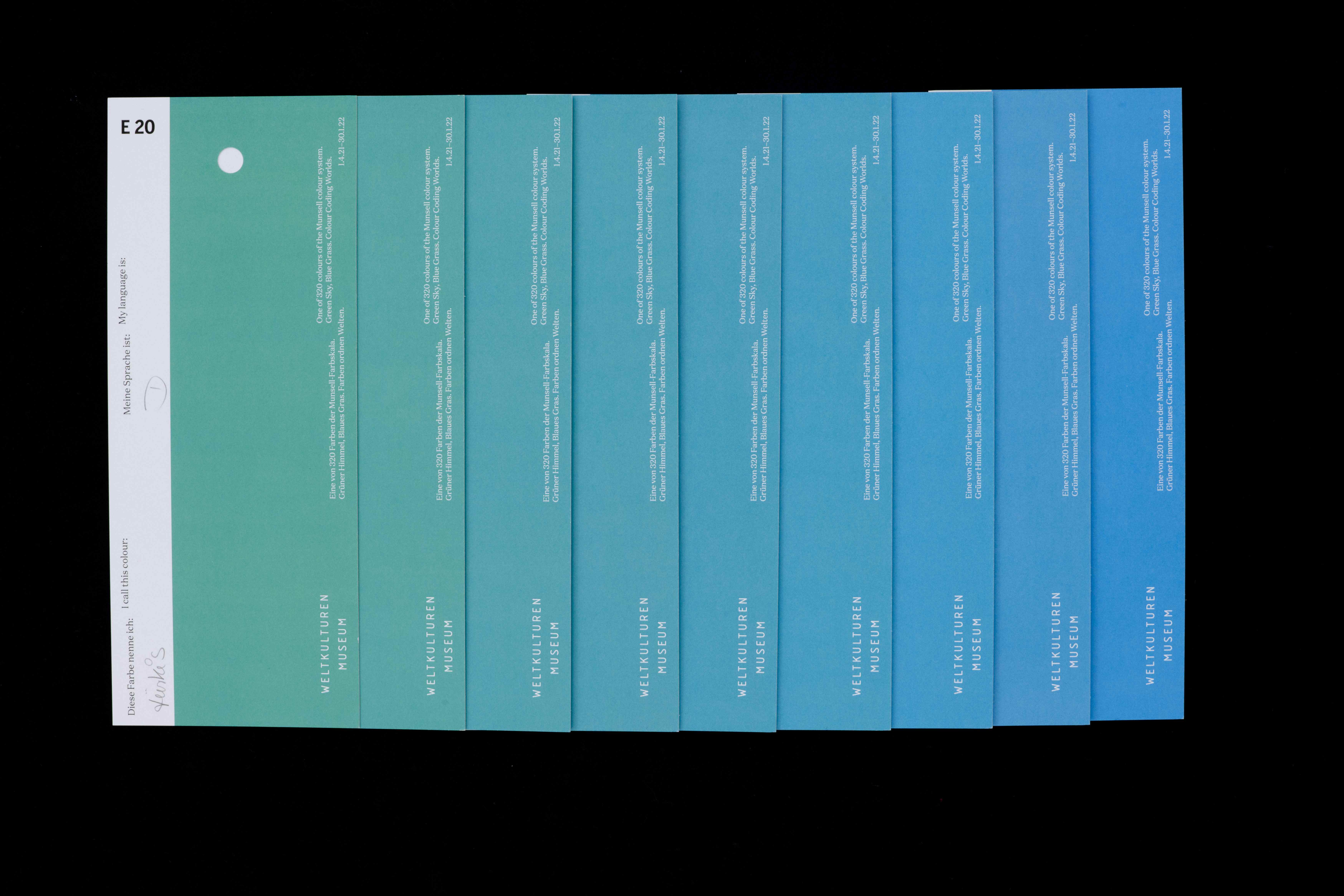
Where does green stop and blue start? Photo: Peter Wolff
This means that colours are not necessarily universal. Consequently, translating one term for a colour with an analogous term, for instance, the German terms blau and grün correlating with the English “blue” and “green”, is often not be a straightforward process. The title of our current exhibition “Green Sky, Blue Grass” plays with this, because in Japanese the meaning of the word ao is by no means identical to the German term for “blue”, neither does midori have the same meaning as “green”. So Japanese poetry might indeed refer to a “green sky” or “blue grass” – something that in the first instance turns our European modes of perception completely upside down. (See also the article by Niels H. Bader in this edition of “Weltkulturen News”.)
That directs our attention to our designations for colours, i.e. the terms that people use to name their impressions of a colour in their language. Since the 1960s, linguists and ethnologists have increasingly been looking at the relationship between colour and language. Their interest is focused above all on the number of colour concepts in a specific society or language, and the colour ranges that these terms comprise.
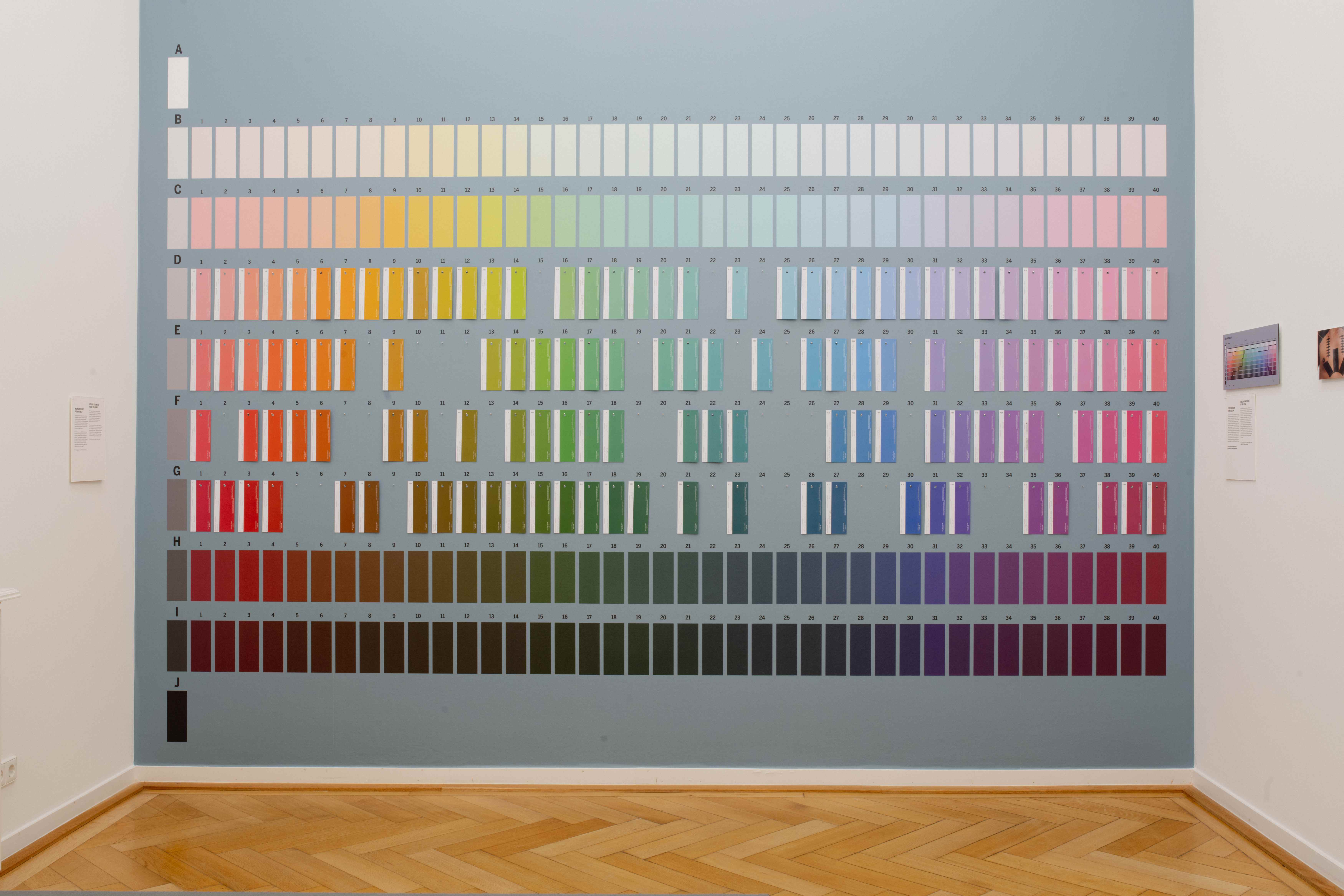
Installing the Munsell colour scale as interactive exhibit. Photo: Peter Wolff
The model still used as reference for such investigations is the Munsell colour system (see fig. 1), which was developed around 1900 by the American painter and art teacher Albert Henry Munsell. For the first time colours were categorised in a three-dimensional colour space as mathematically precise coordinates, depending on their hue, chroma (saturation) and value (brightness). Equipped with a selection of 320 colour charts taken from the extensive Munsell system, researchers have been conducting fieldwork since the 1960s, documenting the terms used by each interviewee to describe a particular hue on the scale. Their findings made it possible to show the colour range covered by a particular term in a particular language, precisely and clearly on a scale.
However, research has traditionally focused above all on abstract colour terms (linguists talk of the “basic colour terms”), which designate “pure” or abstract colour impressions (e.g. red, yellow and blue, but not vermilion, blond or turquoise), in the process largely ignoring all the material and cultural references for a colour term. The pioneers of this research field – Brent Berlin und Paul Kay – believe that there are a maximum of eleven abstract colour terms in a language that appear in a predictable sequence of seven stages. They assumed that this model was universally valid, enabling cultures, or their languages, to be categorised according to the number of their abstract colour terms.
This, however, raises the question – for us, too, while we were putting this exhibition together – of whether the Munsell colour scale, as a supposedly objective tool, is at all suitable for measuring the colour ranges of other cultures or whether it should actually be regarded as an expression of a Western colour system.
So instead we started turning our attention to the material references and cultural meanings of the colour terms, which made it possible to gain a fascinating insight into other cultures that has rarely even been attempted. Surprising things can often be learned about a culture from its colour designations in particular, and the phenomena they describe – and this goes far beyond a simple “abstract experience of colour”.
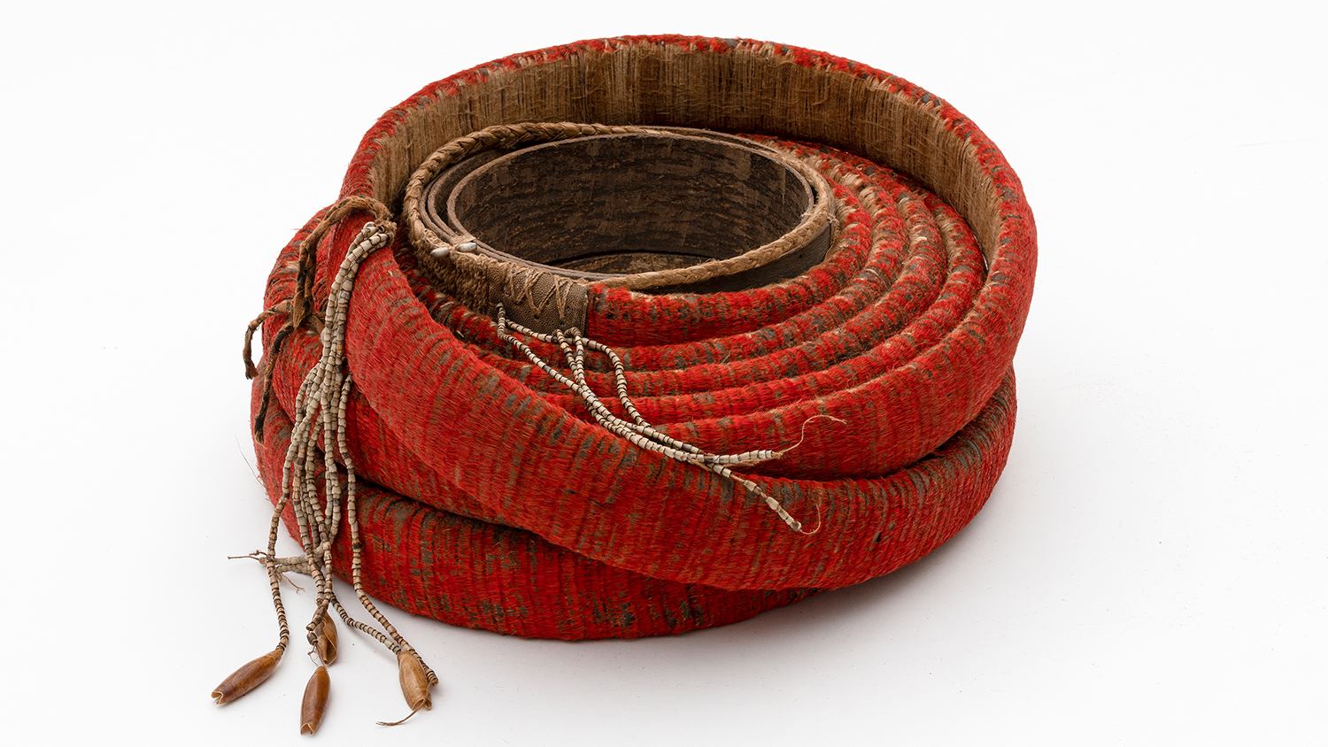
The intensive red of the feather money (mangahau) from the Melanesian Santa Cruz Islands is produced by the artful arrangement of up to 60,000 small cinnabar red feathers of the honeyeater (Myzomela Cardinalis). If the red fades over time, then the feather money roll also loses its value. Feathers, bark, barkcloth, snail shells, Job’s tears seeds. Collected by Volker Schneider, 1980s. Collection Weltkulturen Museum. Photo: Wolfgang Günzel
In Polynesian languages, for example, the colour term kura refers to the impression of colour that comes closest to what would be called rot in German, or red in English, but at the same time it also refers to pleasure, festivities, and ceremonies; moreover, it is the word for the necklace made of red pandanus seeds that is worn at these ceremonial occasions. It represents red dyes such as that produced from red volcanic earth, as well as red feathers – traditional measures of value and status symbols. Kura designates wealth and valuable objects on the one hand, and secret knowledge about the act of creation and the deeds of the gods on the other. The whare kura (which literally means “red house”) is the meeting house of the New Zealand Maori, and the place where sacred knowledge is passed on to the next generation. Today it also has a rather more mundane meaning as the Maori term for “schoolhouse”.
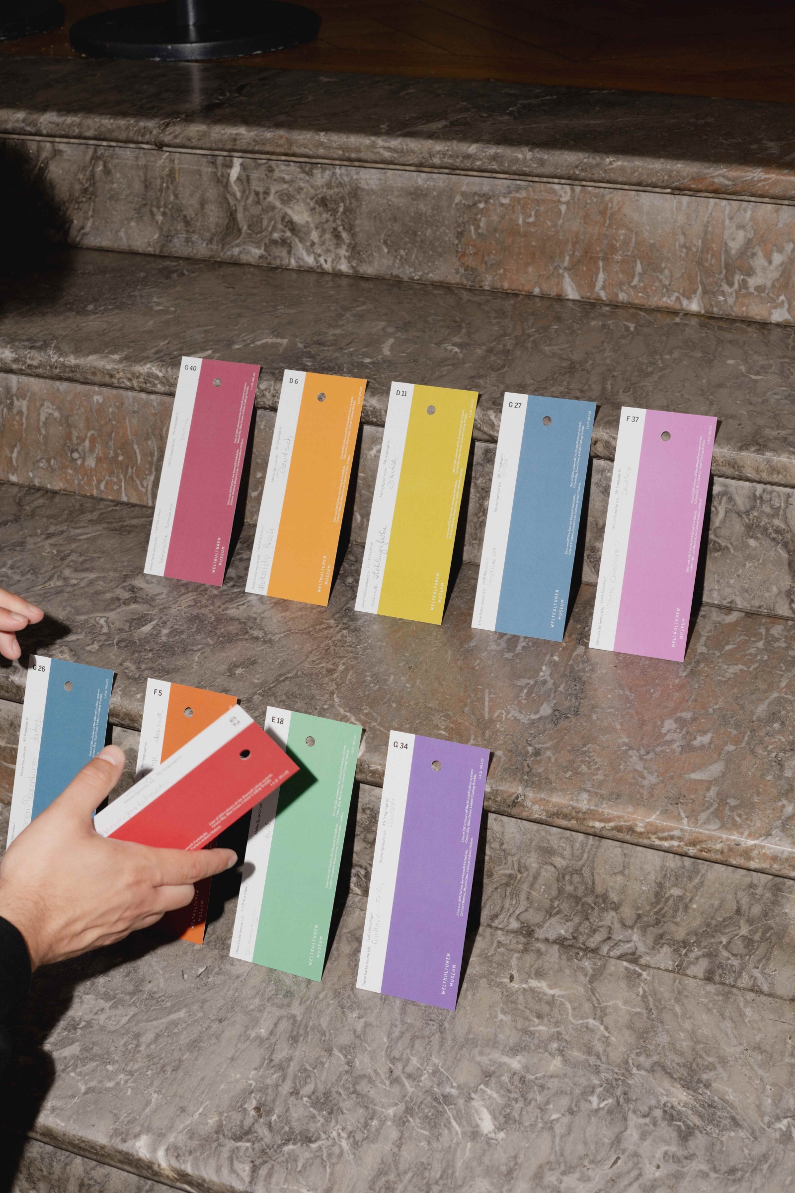
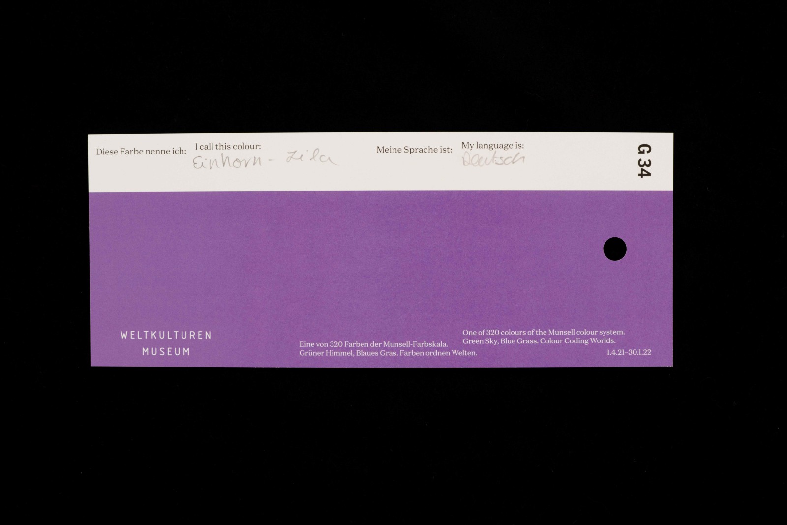
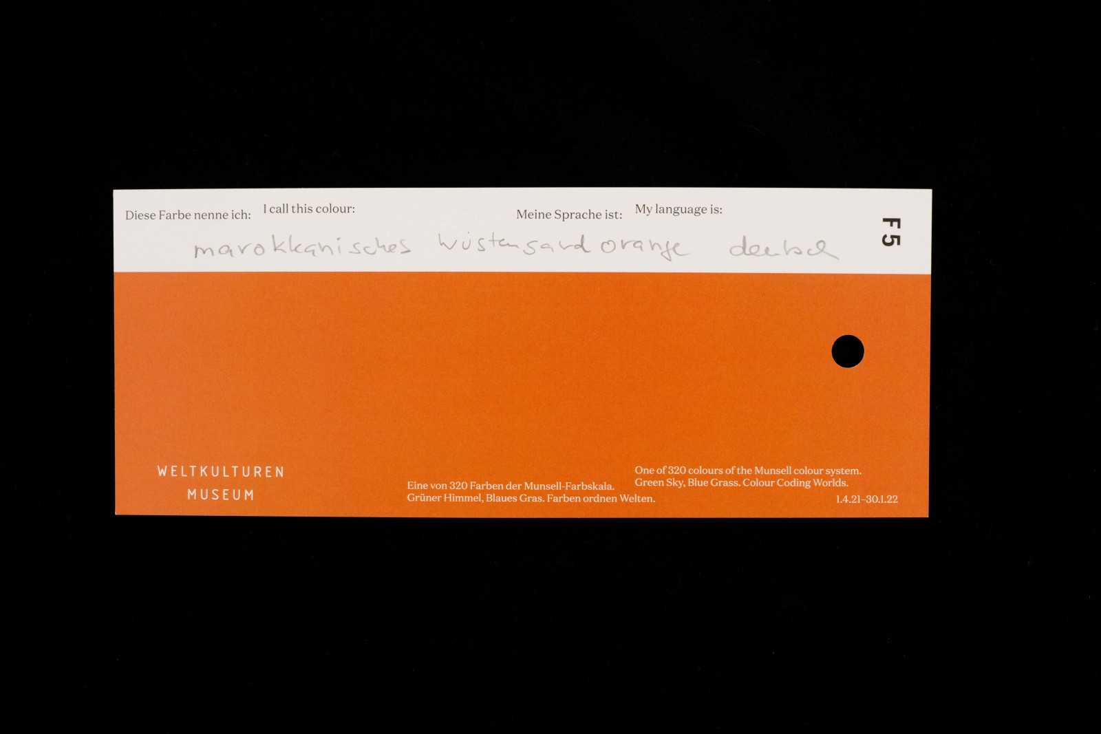
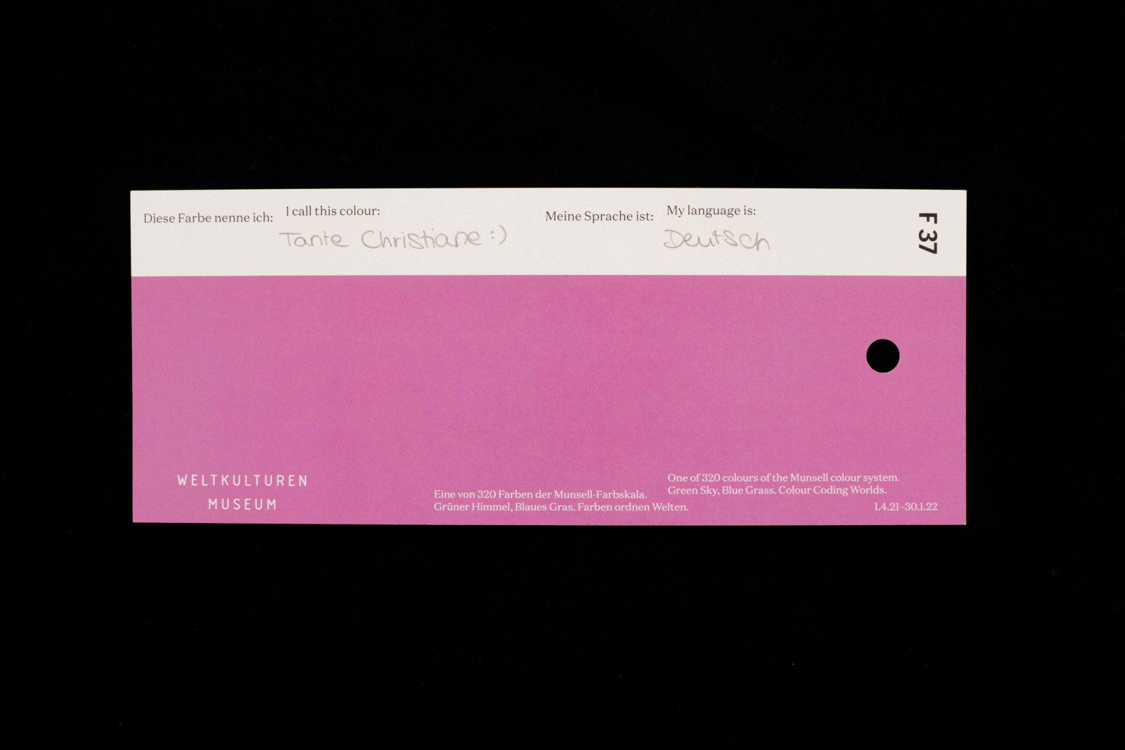
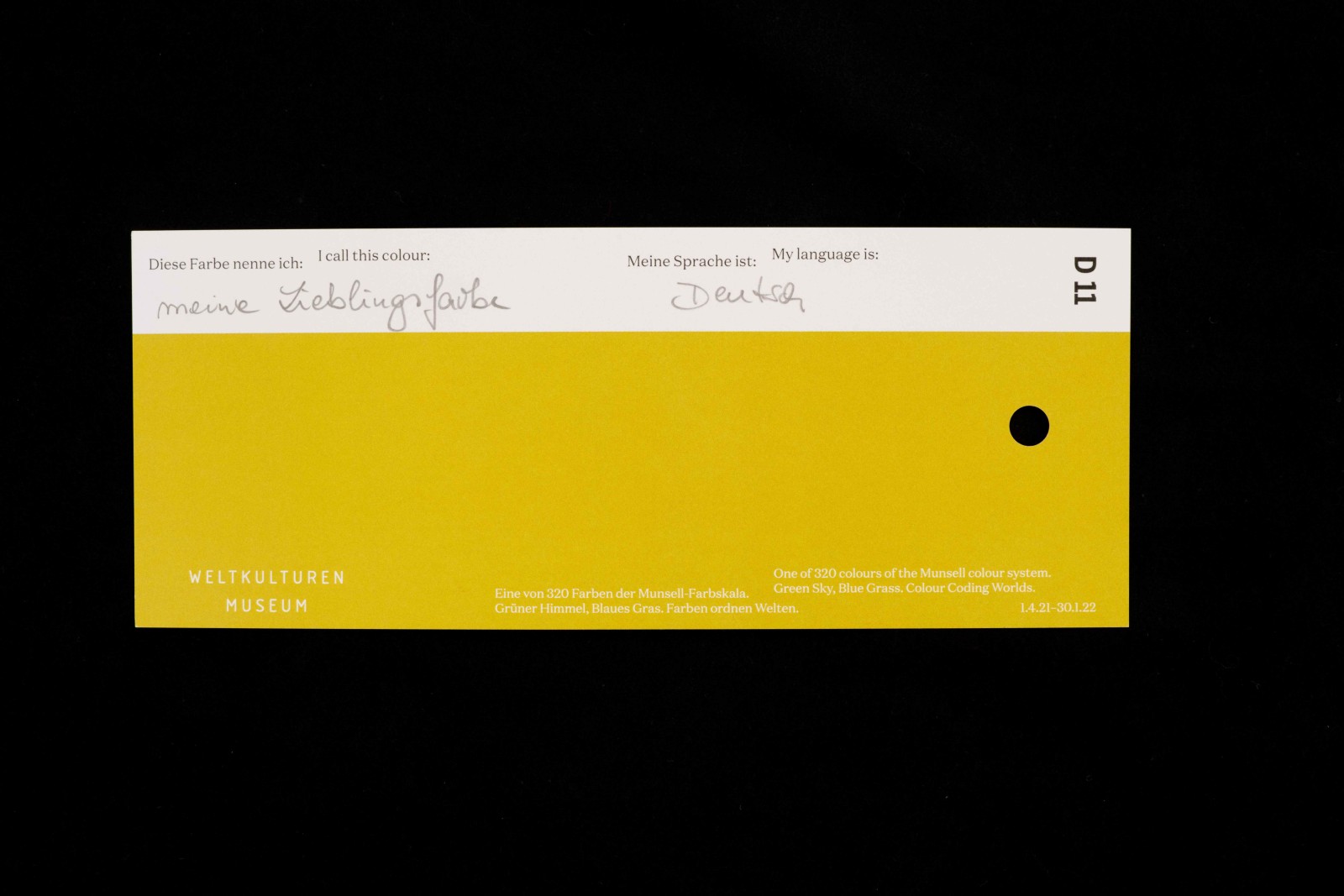
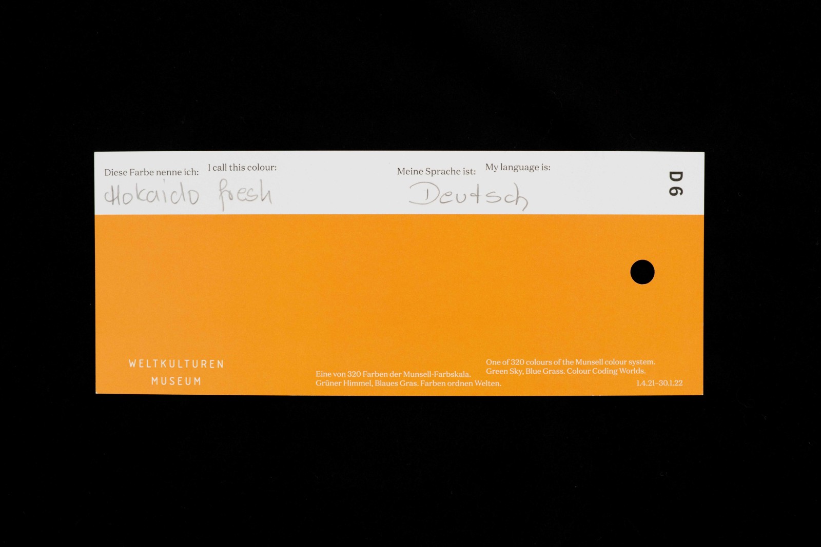
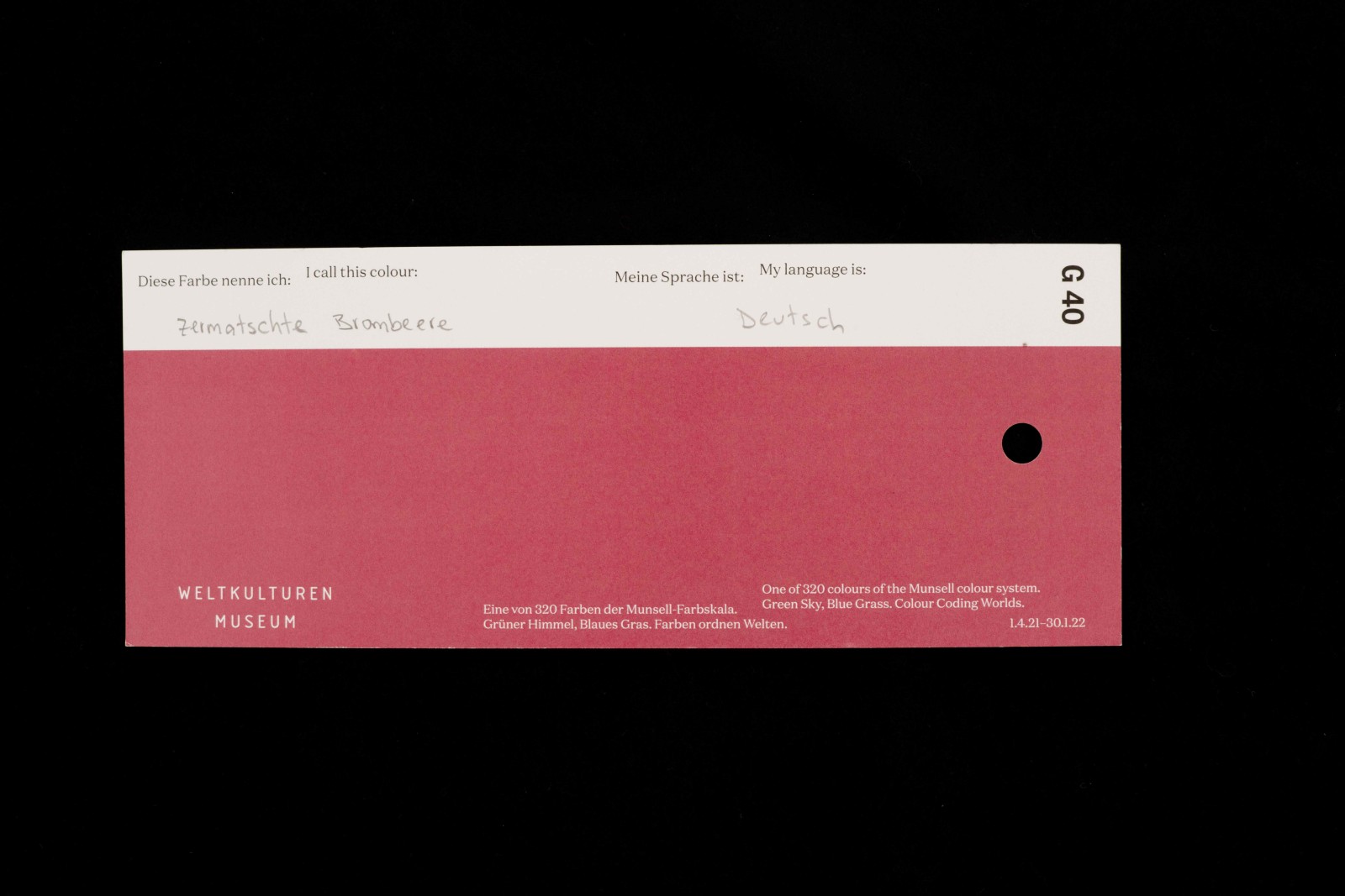
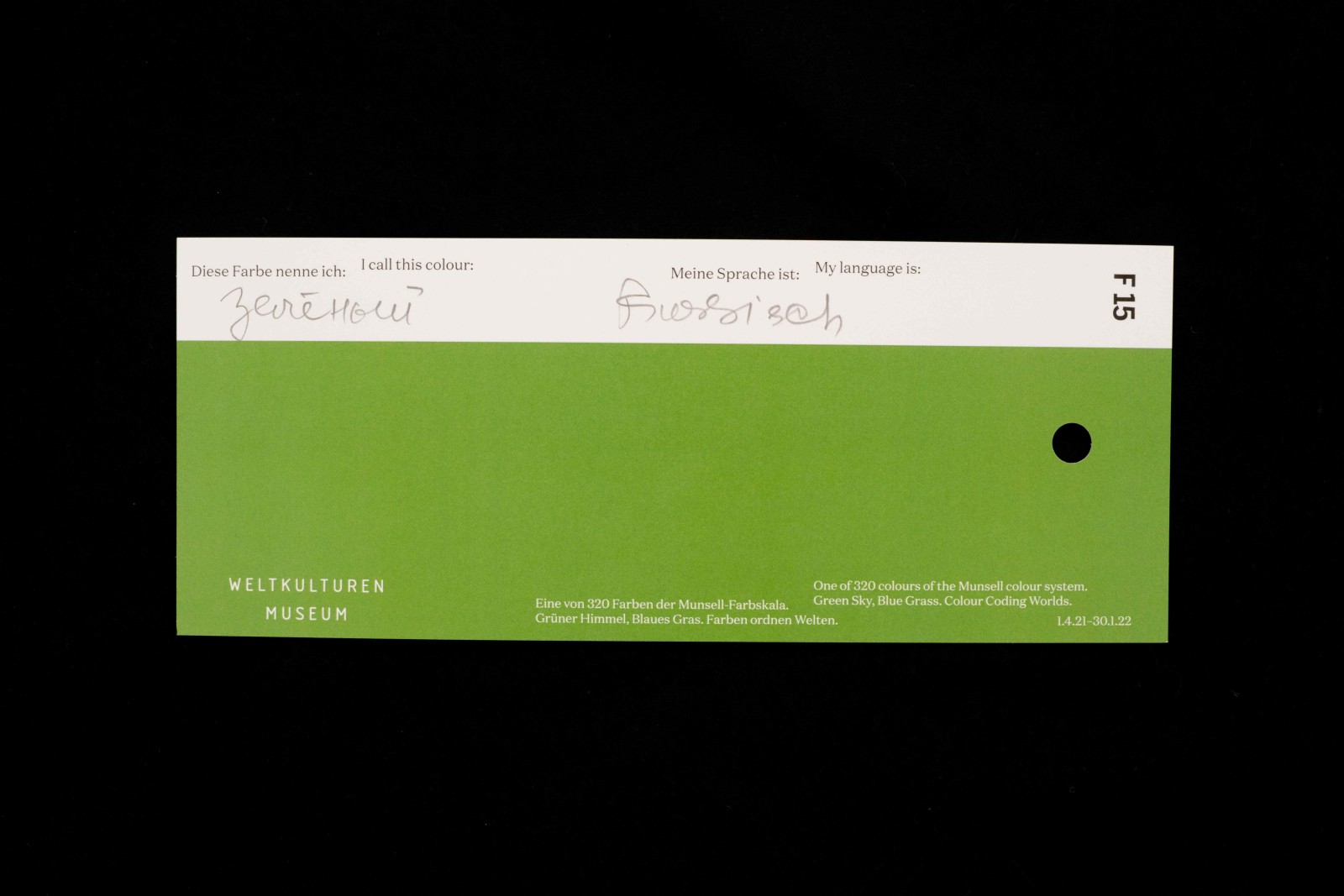
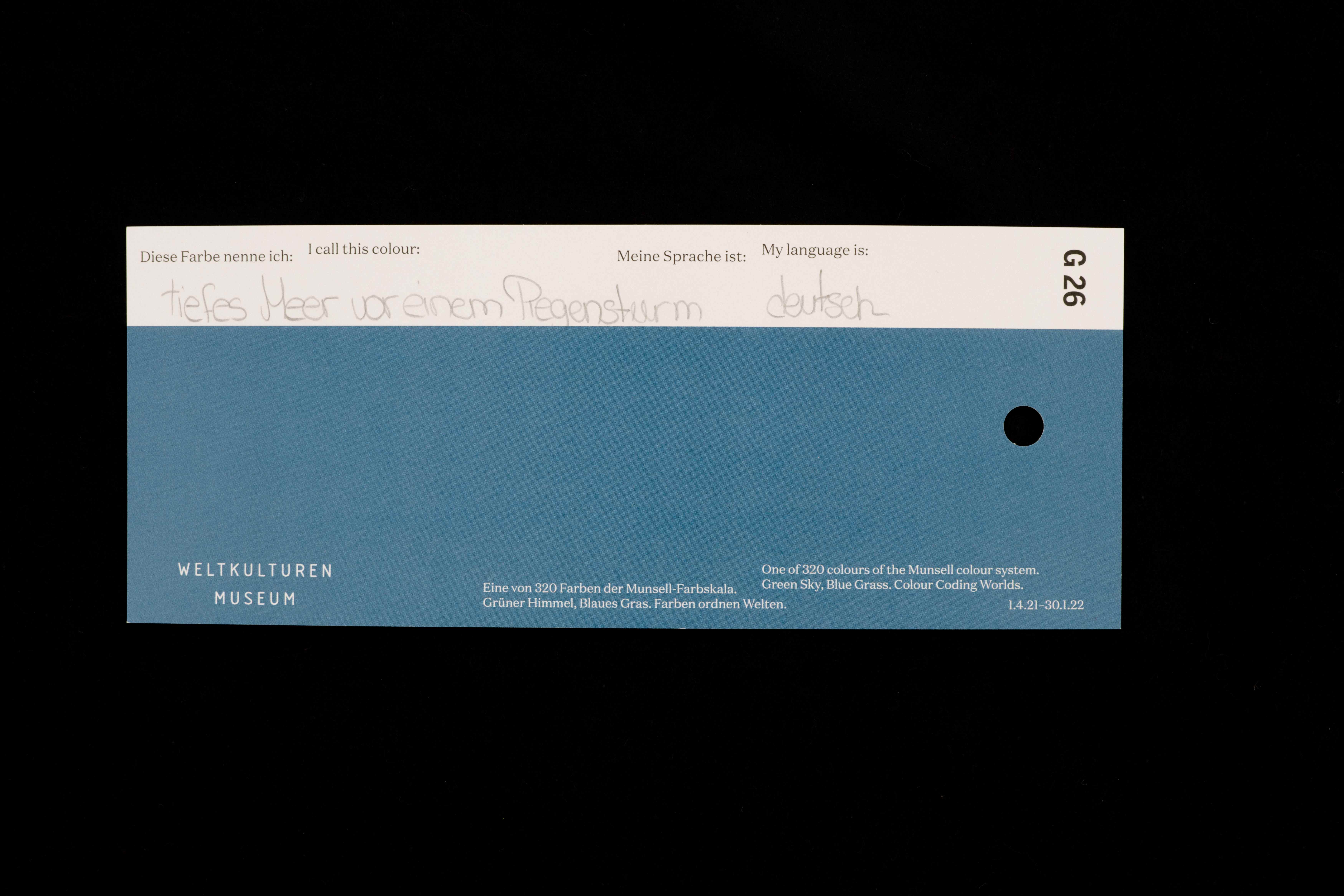
Inspired by these reflections on the deeper meanings of the colour words for the exhibition “Green Sky, Blue Grass”, we embarked upon our very own “field experiment” – in the style of the surveys conducted by the linguists and ethnologists. So we set up an interactive display in the exhibition presenting a selection of colour charts from the Munsell colour scale, and visitors can capture their very own associations for the individual hues on these charts, along with the language that the term comes from.
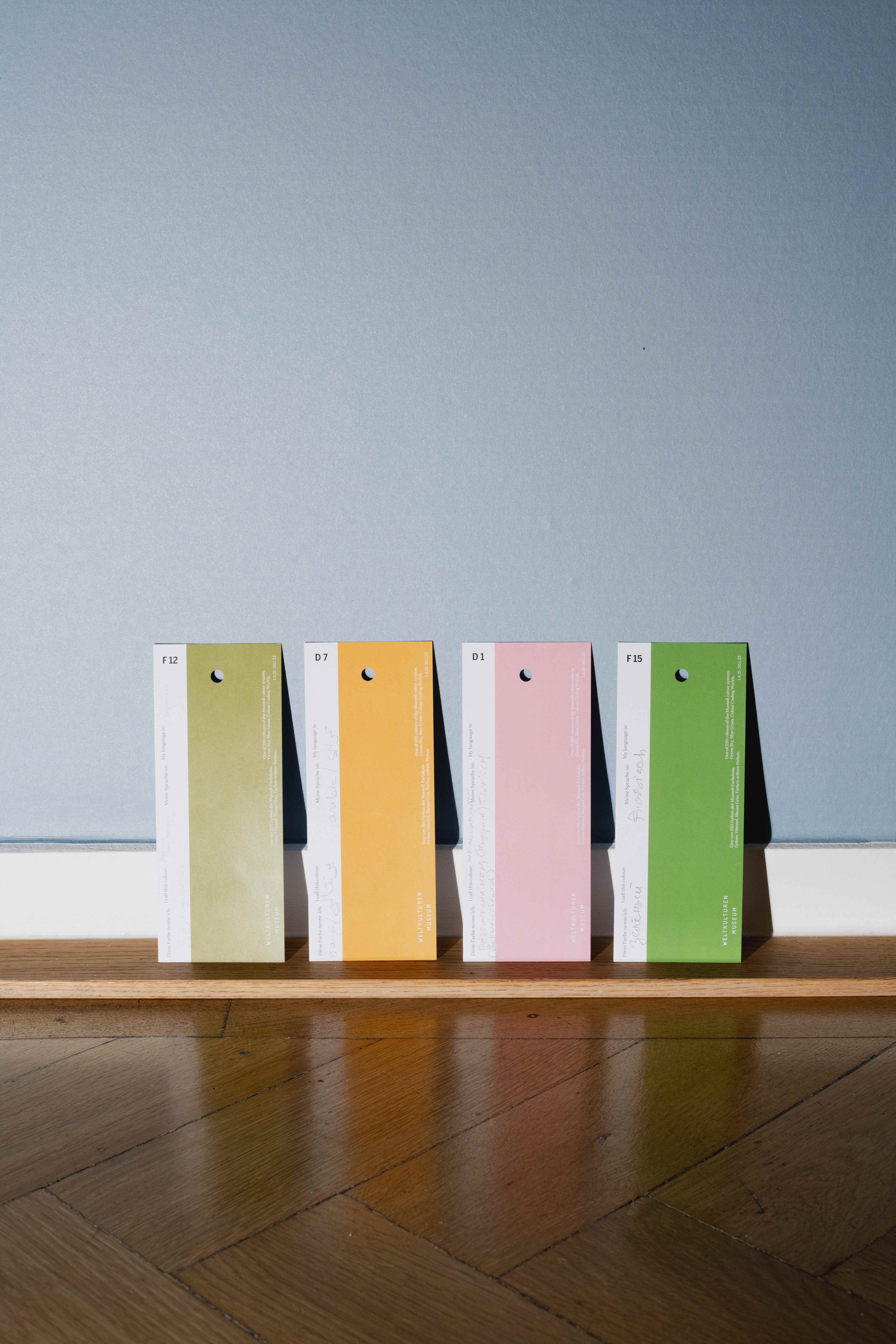
Colour Chips in the exhibition. Photo: Peter Wolff
Taking a look at the colour terms that have been left in the exhibition so far shows that our visitors have an exceptionally imaginative and sometimes even poetic perception of colour: what colour impressions do you think might be meant by each of these terms? And what colour impressions would you connect with these words?:
Early green, vintage pink, Hokkaido fresh, pale blue, forget-me-not blue, amethyst, lavender, coral, universe blue, the colour of ripe oranges, flamingo pink, the colour of hope, snot green, piglet, the deep sea before a rainstorm, crushed blackberries, dinosaur green, Aunt Christiane, summer forest green, moody blue, cool berry, Moroccan desert sand orange, the red in my first set of paints, storm blue, my favourite colour…?
Bio
Matthias Claudius Hofmann studied ethnology and religious studies in Göttingen, Apia (Samoa) and Wellington (New Zealand). At the Weltkulturen Museum he has been curator of the Oceania collection since 2018. His research interest is Polynesian ethnography, with a particular focus on Samoa and the region’s material culture and oral tradition, on conducting ethnological research into objects, and most recently on the ethnology of colour. He is the chief curator of the current special exhibition “Green Sky, Blue Grass.Colour Coding Worlds”.
The article was published in Issue 05 of Weltkulturen News:

